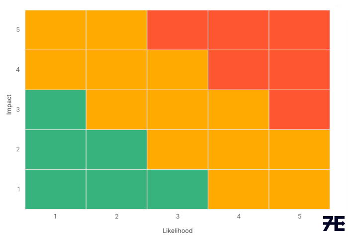
For years, risk heat maps have been one of the most common ways to visualize enterprise risk. Their colorful grids make it easy to show where risks fall on the classic “likelihood vs. impact” scale. Boards and managers like them, and they look good on a slide.
But heat maps are also controversial. Critics argue they oversimplify, hide uncertainty, and can give a false sense of confidence. So, do we still need them?
What Heat Maps Get Right
Heat maps remain valuable for three reasons:
- Clarity: They communicate complex risks in seconds.
- Prioritization: They help focus attention on the “red zone” risks that need immediate action.
- Engagement: They spark discussion. Risk workshops and board presentations often start with a heat map because it gives everyone a shared frame of reference.
Where They Fall Short
The problems are also well-documented:
- Subjectivity: What counts as “high likelihood” to one person may be “medium” to another.
- Illusion of precision: A red square looks authoritative, even if it’s based on little data.
- Static views: Heat maps freeze a moment in time, while risks evolve and interconnect.
Smarter Use, Not Abandonment
The solution isn’t to throw out heat maps, it’s to use them wisely:
- Pair with quantitative methods: Use simulations or financial models, when possible, to challenge or refine the ratings.
- Link to risk appetite: Don’t just show colors, show which risks exceed your defined thresholds.
- Add context and updates: Show trends, interdependencies, and review them often.
As Origami Risk notes, organizations that move “beyond the heat map” don’t abandon it; they embed it within broader ERM dashboards that capture appetite, velocity, and scenario impacts.
Turn Heat Maps Into Action
Heat maps shouldn’t be the final word on risk, but they’re still one of the best starting points. They give leaders a quick, shared picture of exposure and drive the conversations that lead to action.
So yes, you still need a heat map. Just make it smarter: transparent in assumptions, tied to appetite, refreshed often, and complemented by deeper analysis.
Used that way, a heat map isn’t just a pretty chart – it’s a catalyst for real risk management.